
.png)
No turning back - Buy or squeeze?
After clicking on your ad, a visitor goes through three phases of the customer journey before deciding to take further action: relevance, trust and orientation. This process takes place within the blink of an eye. After that, they decide whether to continue or to leave the site. And gone is your hard-earned advertising budget!
Fortunately, it does not have to be that dramatic. Of course, by nature we are notorious ‘clickers’, so you cannot please everyone. But for those people who can potentially be encouraged to take action, it would help if you understand their way of thinking so that you can address why they choose to opt out. We can roughly divide the customer journey into the following phases.
Phase 1 - Relevance
The first question that unconsciously flashes through the visitor’s mind is, ‘Am I in the right place to satisfy my needs?’ This is why your keywords, ad copy and landing page need to connect seamlessly and why semantics actually matter. Therefore, communicate the core of the page ‘above the fold’: visitors should not have to look for a point of reference.
Phase 2 - Trust
Do visitors trust your website enough to keep looking around? This question is often translated as ‘the first impression’. The first thing visitors see when they encounter your ad is something that has aroused their interest or something significant to help them consider making a choice. If something else is then communicated on the landing page, it may create distrust. This disparity may make sense to you, but a customer will probably need an explanation. In such cases, it is important to make your chat function stand out (through a ‘nudge’, for example), so that visitors can take the opportunity to ask questions. If you make no effort to gain the trust of your visitors, chances are you will quickly lose them.
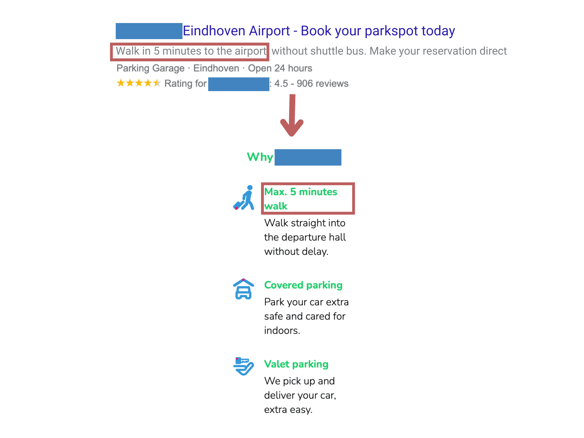
Fig 1 - Your ad’s message must correspond directly with that of your landing page.
Phase 3 - Orientation
We have all experienced that sense of great frustration when we fail to find the actual information we were looking for on a page (after all, you clicked on an ad for it and not on a search result, as you ‘always do’). A search via the main menu and the search function also do not help you find the desired information. Tough luck… apparently, you are not going to find what you were looking for.
Perhaps the site in the example above actually did contain the information in question, but was unfortunately so hidden on the page that it simply did not stand out. There may have been an image that was drawing all your attention, for example, or there was too much text to read through to find the information you want. There are all sorts of reasons why visitors are unable to find what they are looking for and therefore leave.
If your visitors have not yet left at this point, there is a greater likelihood they will be converted on your website.
Phase 4 - Encouragement
Far too often we assume that only a B.O.B. (‘Big Orange Button’) determines whether people buy a product, fill out a form or subscribe to a newsletter. Although it is true that buttons with text and color play a role, it is more important to understand the situation from the visitor’s perspective and to tell them clearly why it is worth their while to click on that button right now. ‘Ordered today, delivered tonight’, ‘3 items in stock’ and ‘Free shipping’ are all triggers that may just persuade visitors to take the step. Be critical of your pages and encourage visitors to take action now.
Phase 5 - Assurance
Purchasing an item online involves risk. And whichever way you look at it, the biggest risk for an online purchase lies with the buyer. After all, they often have to pay in advance before they receive anything. And although we are used to things going smoothly in the vast majority of cases, the slightest hiccup can cause us to become suspicious. Use these tips to give the buyer a little more assurance to get them over the threshold:
- Be accessible: use a chat function, display contact and address details and pay plenty of attention to customer service on your website;
- Provide guarantees that you can live up to: your terms and conditions often include ‘standard’ conditions that protect the buyer’s rights. Take the most appealing one, simplify it and display it as a selling point on your website;
- Provide details where necessary: communicate delivery times as clearly as possible; confirm delivery details after purchase and have a clear and simple return procedure.
Phase 6 - Convenience
If ever there was a conversion killer, it is a complicated table with different price structures, a delivery time that depends on multiple conditions or a long form without any explanation that needs to be filled out at the end of a laborious search. Your visitors will get tired during their customer journey due to the amount of information they have to process. Although they may not experience this consciously, it can work unconsciously on their willingness to continue making choices or even lead them to discontinue the purchasing cycle. These tips will help you keep mental fatigue in your webshop as low as possible and reduce the ‘cognitive overload’ that your visitors have to contend with:
- Do not show all the complicated pricing information at once. Only show the most relevant information generated by the visitor’s choices;
- The same applies to delivery times or moments of contact. Show the most relevant information you can provide after a visitor has made a choice;
- Consider a lead or purchase process that includes a number of steps if it is a long process.
Takeaways
As an SEA specialist, you can exert the most influence in the relevancy of your ads with regard to the landing page and the confidence visitors have in answering the motivation for having clicked on your ad.
The further they go on the customer journey, the more they make their own experiences count in a final conversion. However, that does not mean you have to stop contributing altogether. Involve your conversion team in choosing landing pages, make it clear to them what your goal is and ask them if they have any input for your work. No one can optimize a customer journey alone. Even a well-oiled machine needs constant maintenance.
This blog is written by Bas Linders - Happy Horizon. He was one of our speakers during the Dutch event: Adchieve Academy Live.